92% promoters, 0% detractors. A loyal base to build on.
UX design · Telecom · Client
DrimTel
Redesigning the signup for a purpose-driven Australian telco, so an NPS above 90 finally reads as one.
Long story short
An NPS above 90, and a signup that still buried the point of the brand.
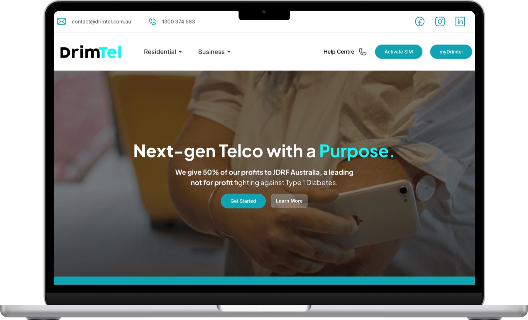
DrimTel is a 100% Australian-owned telco that gives 50% of its profits to JDRF Australia, a leading not-for-profit fighting Type 1 diabetes. That mission is the whole identity of the brand, and yet it barely surfaced during onboarding.
Customers already loved the service. The task was not to fix a failing product but to make the signup align people more closely with the mission and simplify the journey to a plan, especially for the 18 to 35 audience the brand wanted to reach.
Net Promoter Score92
Profit to JDRF Australia50%
The reason the brand exists, missing from the flow.
Audience the redesign targeted18–35
Younger customers choosing NBN, mobile and eSIM plans.
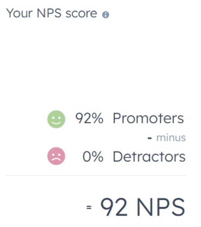
The score that framed the brief. An NPS above 90 meant the problem was not satisfaction. It was that the signup did not carry the mission or the clarity the brand deserved.
01 — Discover
To kick off, I went wide: what does the onboarding actually feel like today?
I ran exploratory research to understand DrimTel's current experience from three angles at once: a competitor analysis of how other Australian telcos handle signup, a UX audit of DrimTel's own flow against usability heuristics, and a client meeting to hear the business and its constraints first-hand.
The client meeting mattered most. DrimTel wants to stay niche rather than chase the incumbents, sends personalised thank-you notes today, and treats accuracy as mission critical: a wrong address on an emergency service carries a real penalty. That framing shaped everything after it.
Method: Competitor analysis, UX audit, client meeting
Frame: Agile UX · Discover, Define, Develop, Deliver
Frame: Agile UX · Discover, Define, Develop, Deliver
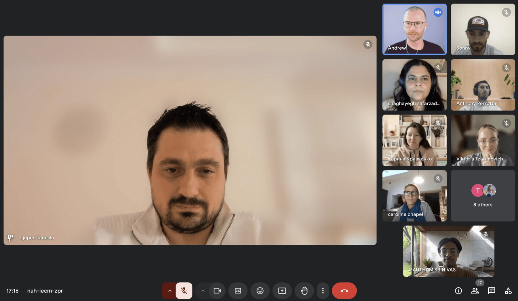
Client meeting. Hearing the business first-hand: stay niche, keep the personal touch, and treat customer detail as mission critical.
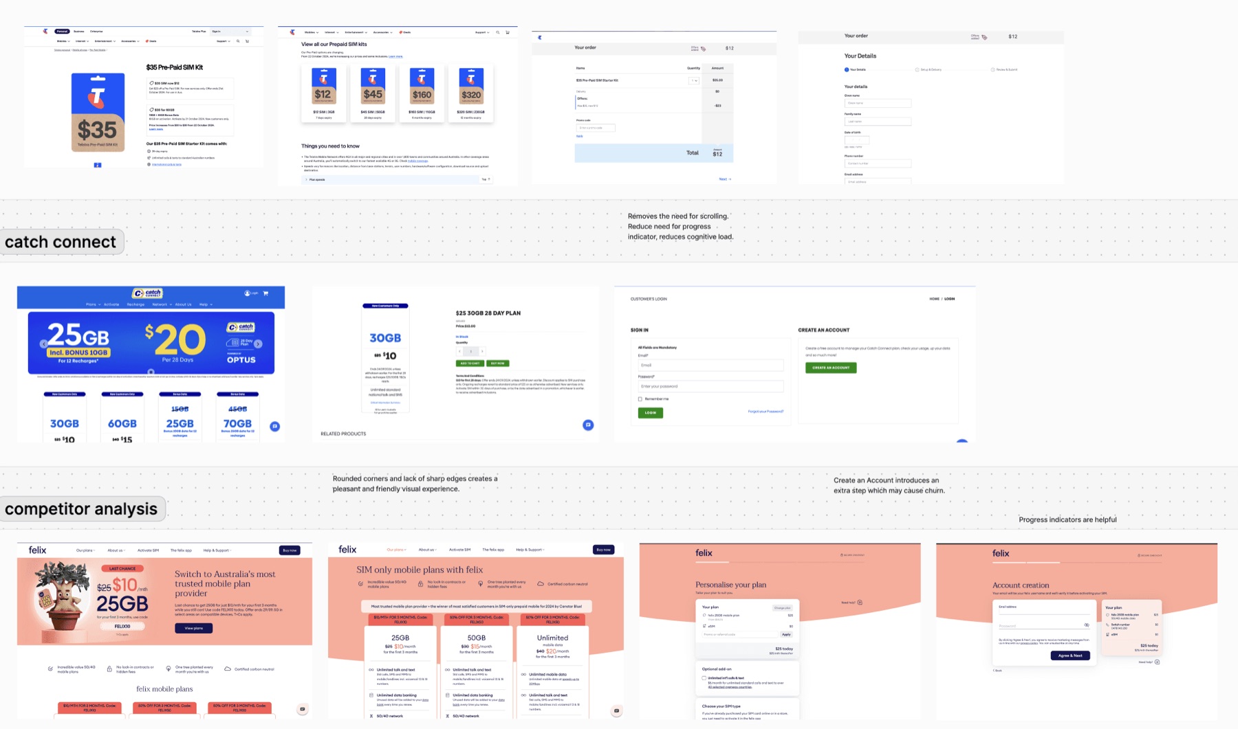
Competitor analysis. Where rivals reduced scrolling and cut steps, and where an extra account-creation step risked churn. Rounded, friendly visuals and clear progress indicators kept recurring as the things that worked.
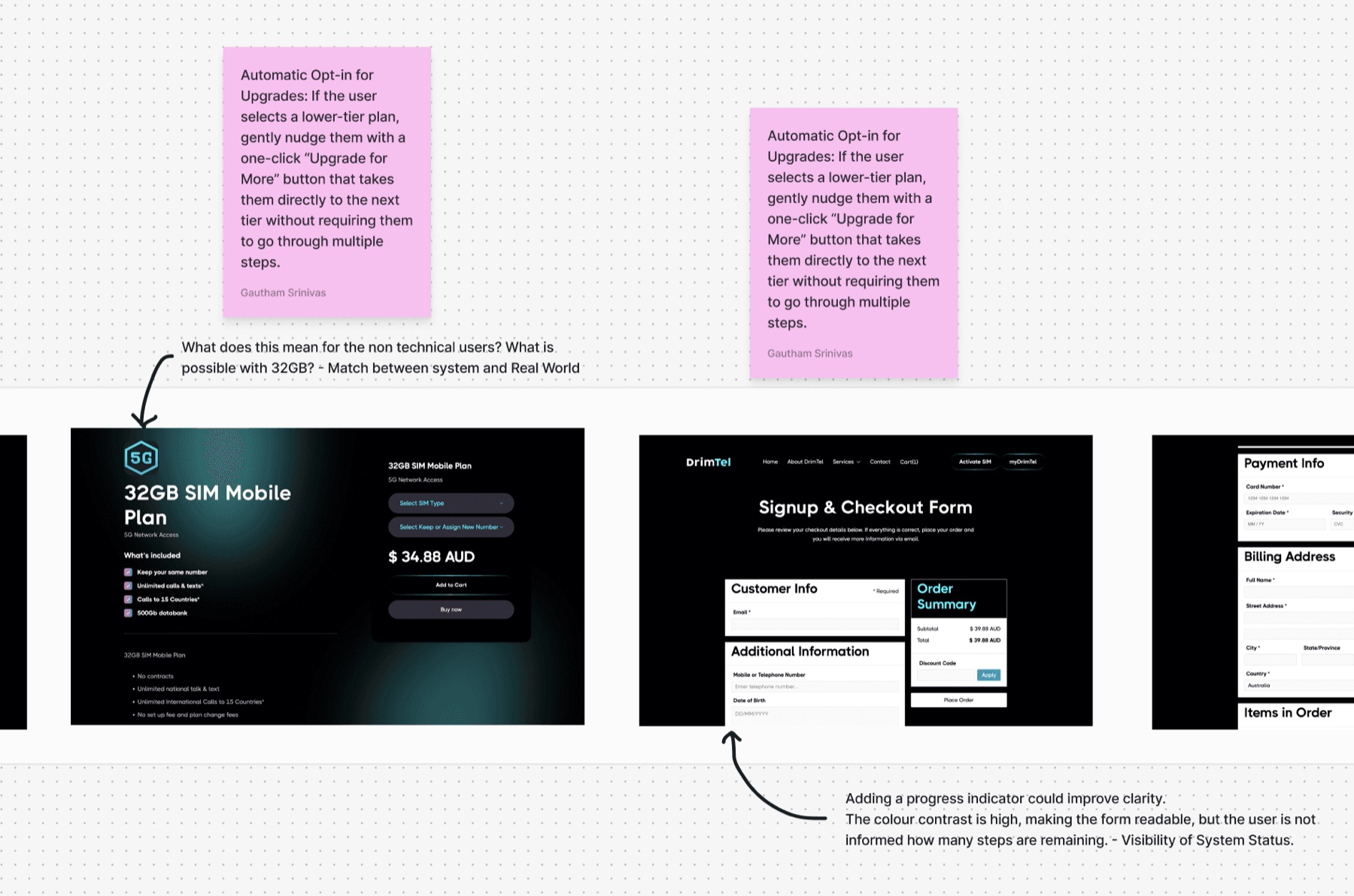
UX audit. Auditing DrimTel's own plan and checkout screens against usability heuristics, from match with the real world to visibility of system status.
Define
I clustered everything into an affinity map, then wrote the problem down.
Research notes from the audit, the competitors and the client all went onto one wall and were grouped until the themes were undeniable: the mission was hard to find, plan selection was hard to scan, and the brand's value was not obvious at the moment of choosing.
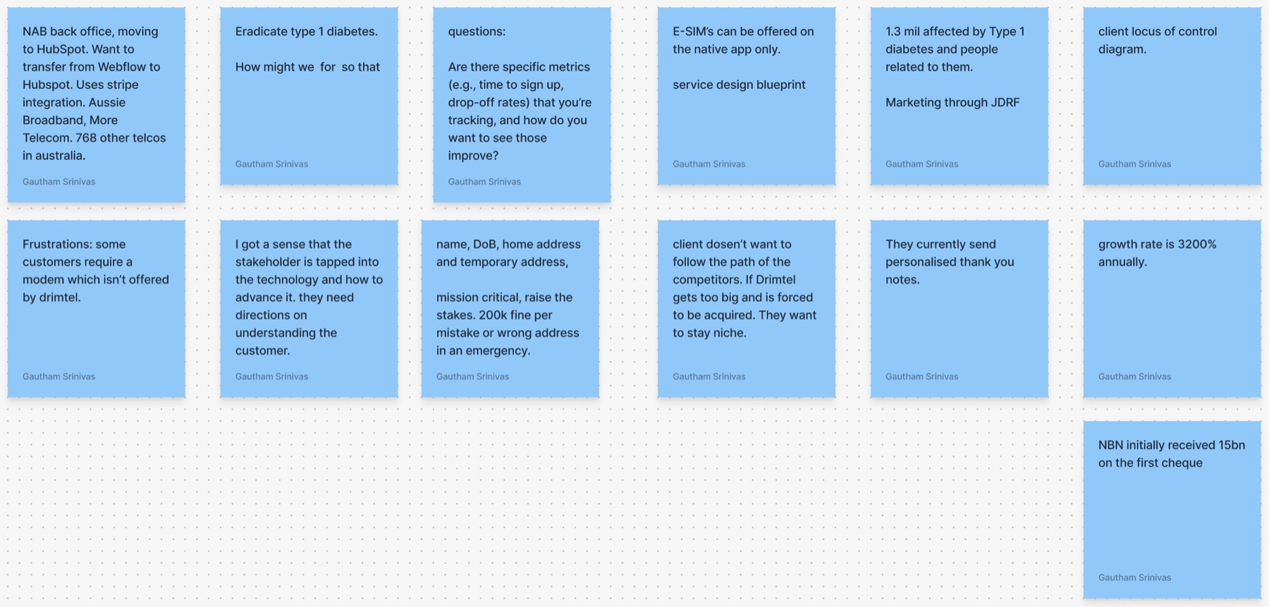
Affinity map. Raw notes from every source, clustered until the recurring problems surfaced on their own.
The problem statement
How might we simplify DrimTel's onboarding so that new customers feel more connected to the mission of eradicating Type 1 diabetes, increasing the Net Promoter Score for young people between 18 and 35?
02 — Test
To find the real bottlenecks, I watched people try the current signup.
I ran unmoderated user testing across brand recall, first-click and full usability tasks, then read the results next to heatmaps, product analytics and the critical user journey. Each source answered a different question, so no single one had to be trusted on its own.
The findings were specific, and one of them was decisive.
Heatmaps
The CTA was clear
Attention landed where it should. The primary action was not the problem.
Product analytics
Users were likely to promote
The satisfaction was real and measurable, consistent with the high NPS.
User journey
Choosing a plan took longest
The delay sat in plan selection, not in checkout or the CTA.
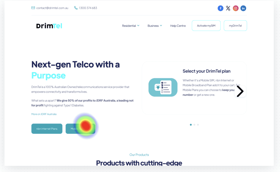
Heatmap. Attention was concentrated and correct. The friction was not in whether people found the buttons, but in what happened after.
03 — Ideate
An effort-impact matrix, so I built the changes worth building.
I mapped every idea against effort and user value and focused on the low-effort, high-value quadrant: a simplified checkout with clear progress indicators, a guided plan selection, and putting the brand identity and purpose on the homepage.
Three themes carried the most weight, feasible, impactful and repeatedly reported. These were the key pain points.
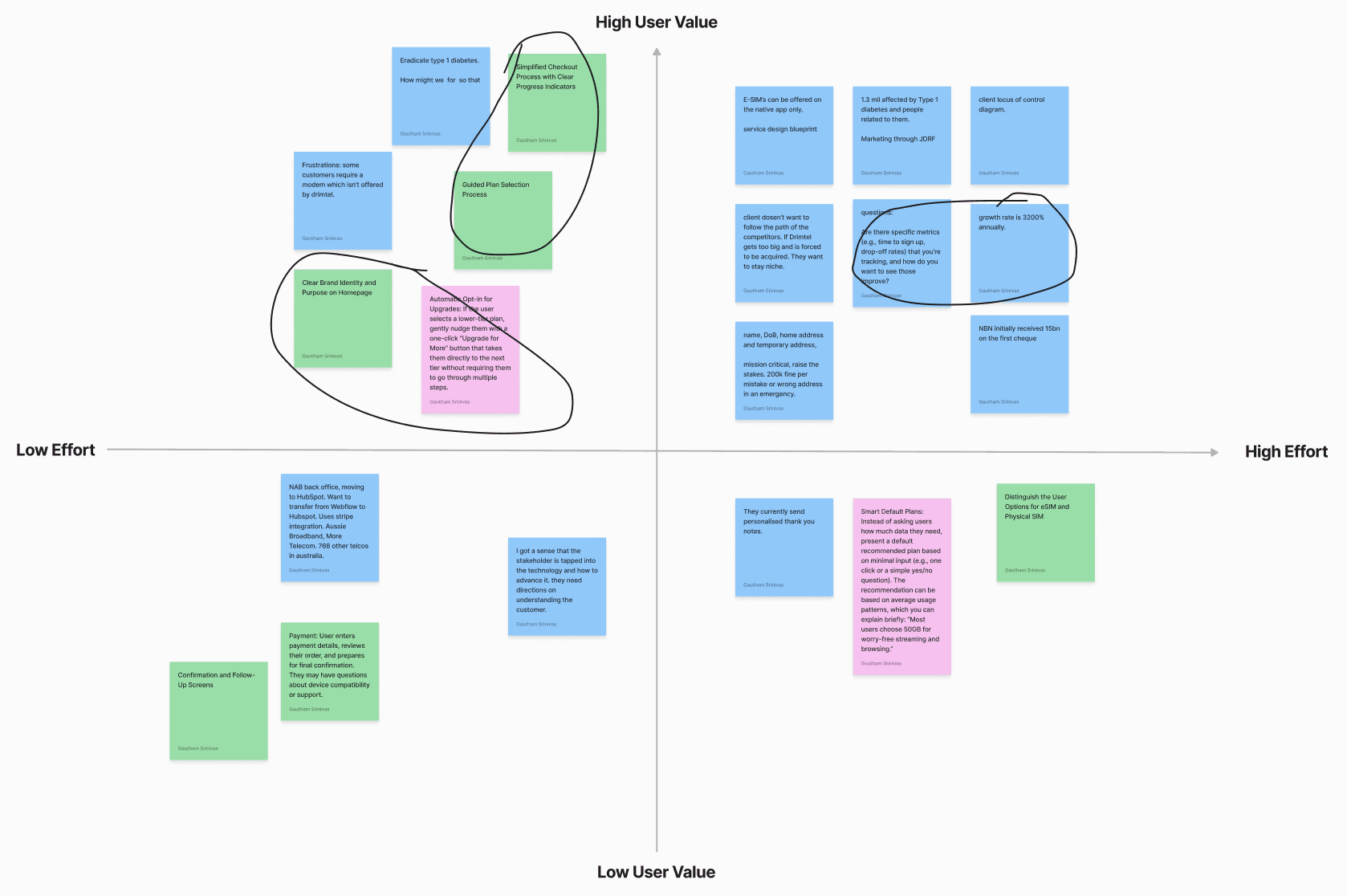
Effort-impact matrix. Ideas plotted by value and effort. The circled, low-effort high-value cluster set the scope for wireframing.
Theme 01
The mission is unclear at a glance
The pledge to donate 50% of profits to fight Type 1 diabetes is central to DrimTel's identity, but it was not integrated into onboarding. I aimed to connect users to that purpose from the start.
Theme 02
SIM options are hard to scan
The choice between SIM and eSIM created unnecessary complexity. Focusing on clarity and guidance would reduce friction and improve confidence in the selection.
Theme 03
Brand value is not obvious
The flow needed a cohesive brand experience that resonated with users while still supporting the functional job of signing up.
04 — Develop
Wireframes that streamline signup and put the mission up front.
Wireframing let me streamline the signup, highlight DrimTel's mission and simplify plan selection in one pass. The homepage leads with a bold tagline for the purpose and a large background image to carry the unique selling point, and the plan options grow in size to match the amount of data they offer, so scanning a plan is reading a shape, not a table.
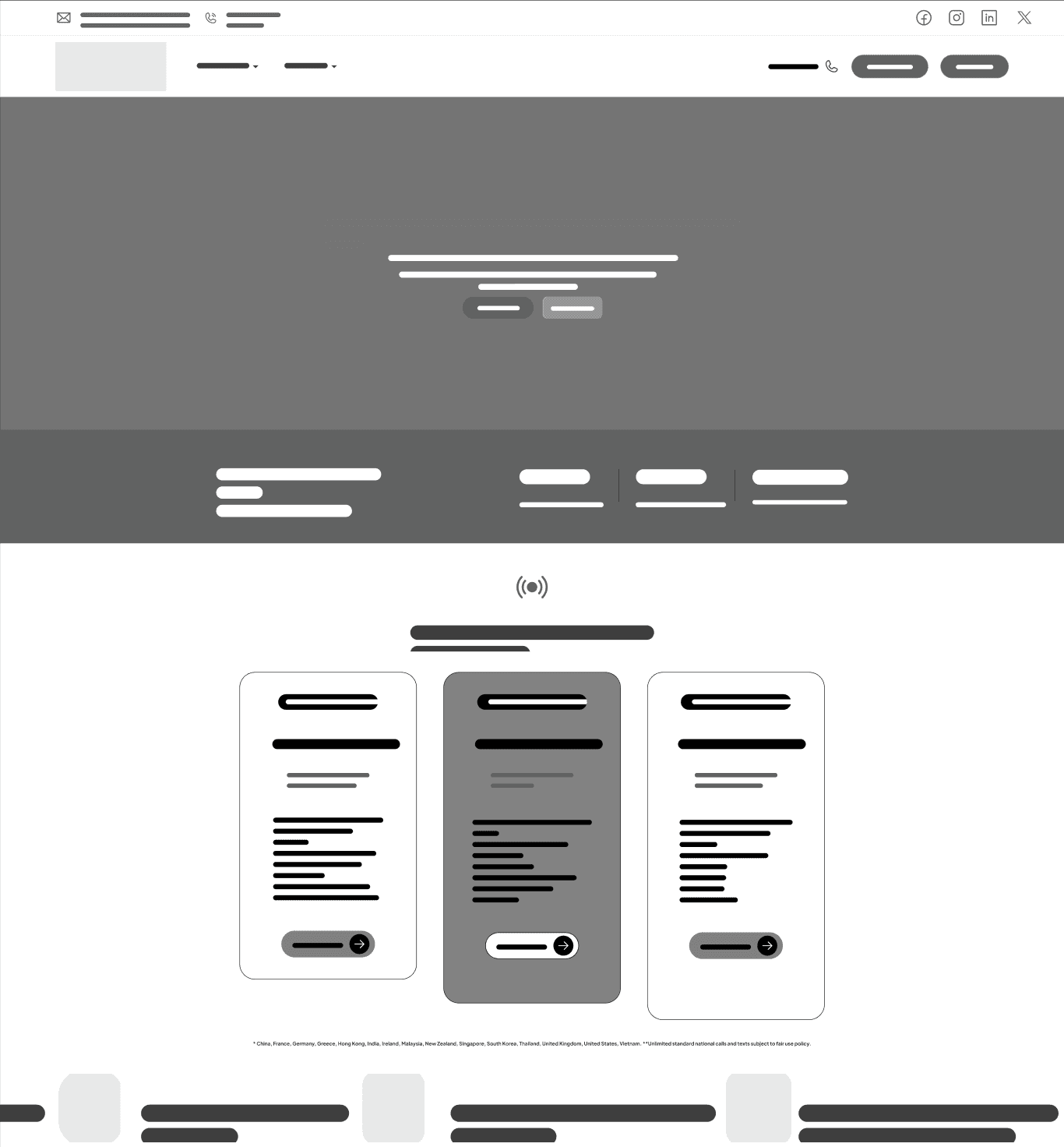
Wireframe. Mission first, then plans sized to their data allowance, so the hierarchy does the explaining before any copy does.
05 — Deliver
Finally, I prototyped and built it in Framer.
The redesign moved from wireframe to a working, developed prototype in Framer: the mission stated in the first line, a large image carrying the brand, and a plan selection that reads at a glance. The signup a telco with an NPS above 90 should have had all along.
Learnings
What the project taught me.
- A high NPS is a brief, not an all-clear. Satisfied customers can still be poorly served by a flow that hides why they chose you.
- Read every signal against the others. Heatmaps, analytics and the user journey each answered a different question. The delay in plan selection only stood out once they were laid side by side.
- Let hierarchy carry the meaning. Sizing plan cards to their data allowance did more for clarity than any amount of explanatory copy.
- Build it to know it. Taking the redesign all the way to a working Framer prototype was what made the decisions real.