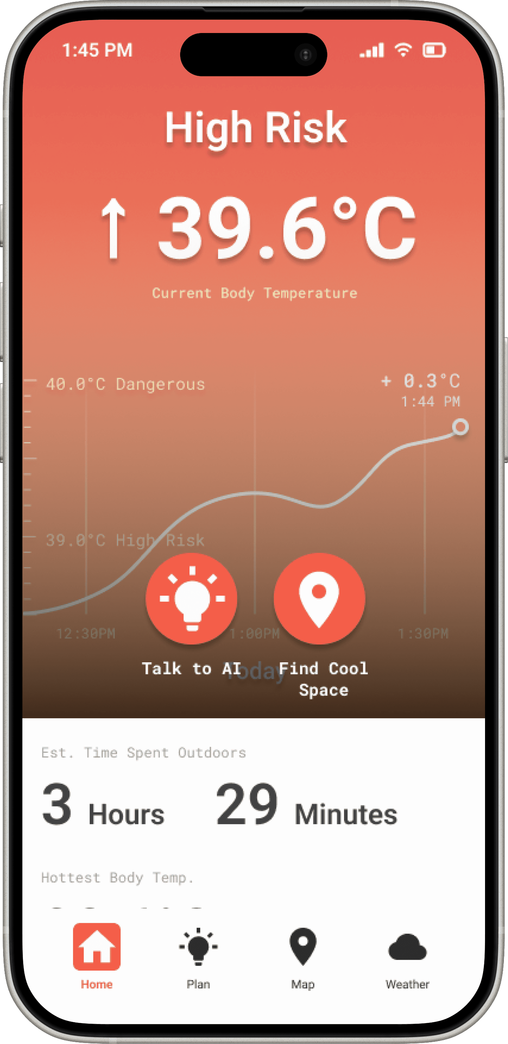

On staying indoors“You cannot take a walk outside when it is so hot. You are restricted to staying indoors.”
Product design · Interactive · Team of 3
Heatscape
An AI navigation and cooling-alert system that helps people stay safe as cities get hotter.
Long story short
Cities are getting hotter, and people react to heat too late.
Temperatures are rising fast in the Sydney CBD, and with them the risk of heatwaves and heat-related illness. Heatwaves already kill more Australians than any other natural disaster, more than storms, fires and floods combined.
Heatscape is a system of three of us built in a design studio: an app that reads live conditions, guides people to the nearest cool space, and pairs with wearable cooling, so someone acts before the heat becomes dangerous, not after.
01
Research
On-ground observation, interviews and ethnographic studies across Sydney, plus a scan of global case studies and competitor apps.
02
Design
Over thirty features brainstormed and cut to three, then two wireframe iterations tested with real users and UI/UX experts.
03
Build
A coded MVP integrating OpenAI and Google Maps on an ESP32 board. Scored a Distinction and a System Usability Scale of 87.
01 - The context
The heat is not evenly spread. The city concentrates it.
Urban areas can be up to 7°C hotter than surrounding rural areas because of the urban heat island effect, which raises the risk of heat-related illness. Every degree of warming makes heatwaves more frequent and more severe, and cities are where that heat gets trapped.
We explored existing data, literature and market trends to map the impact of urban heat. By analysing global case studies and quantitative data, we identified the areas in Sydney where the issue is most urgent, and set the context for the design.
Sources: NSW Government (2021), WSROC (2018), IPCC (2021), Bureau of Meteorology (2021)
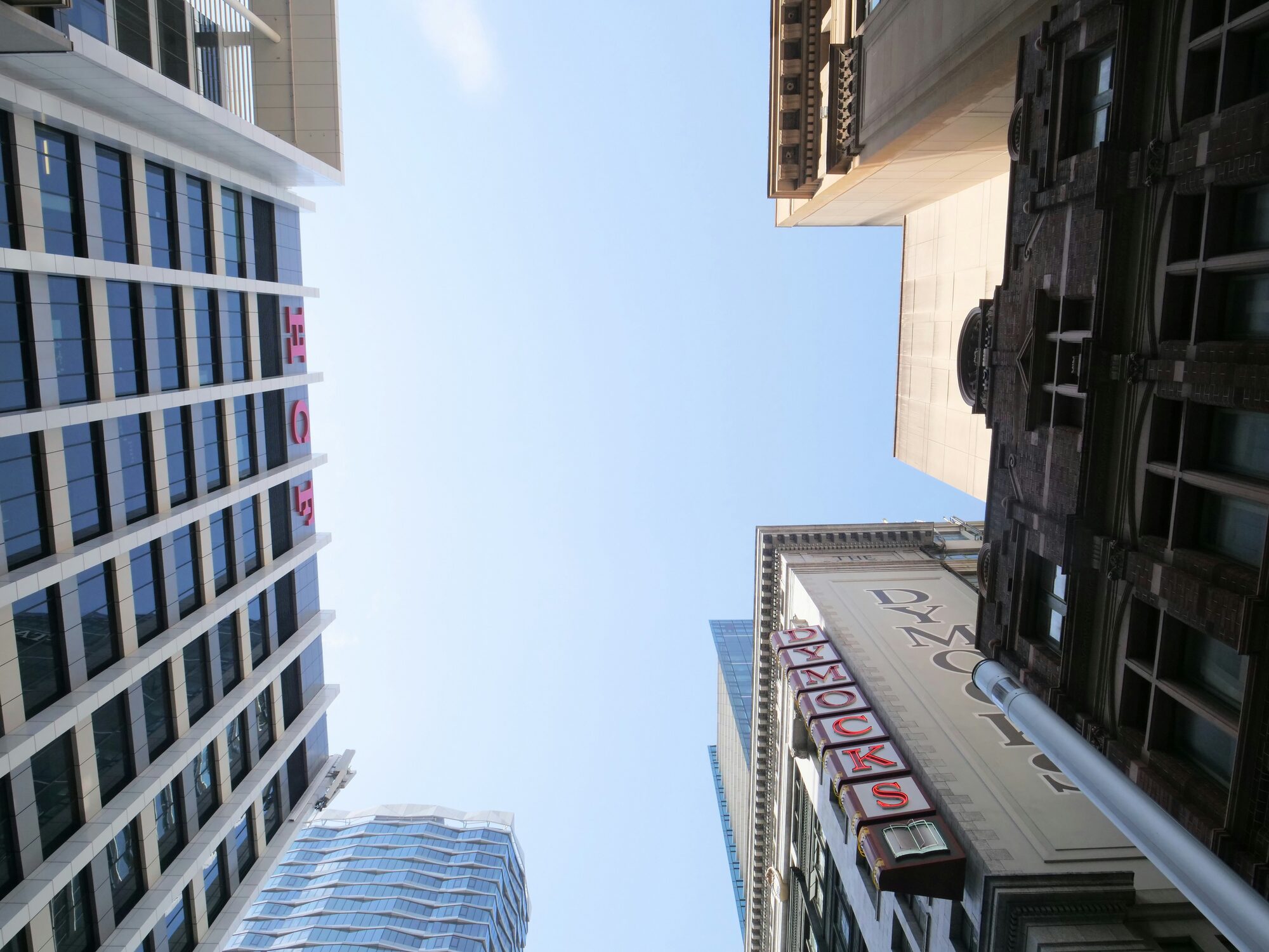
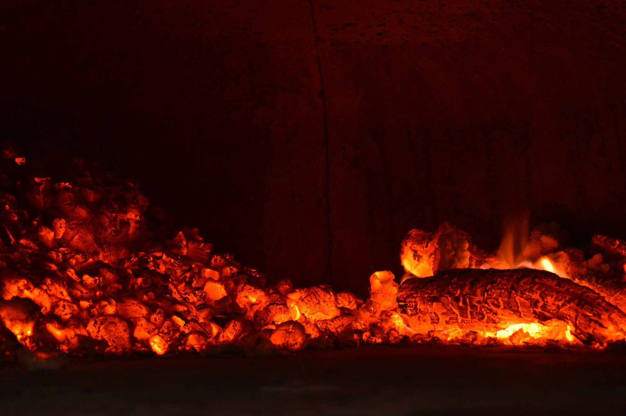
Where the problem lives. Dense, low-green parts of the CBD run hottest, so the design had to work in exactly the places people are least able to escape the heat.
The question
How might we mitigate rising temperatures and enable adaptation to climate change in urban areas, in line with the disaster risk management principles of the Sendai Framework for Disaster Risk Reduction 2015-2030?
02 - The research
People adapt to heat in quiet, telling ways.
Through on-ground observation, interviews and ethnographic studies, we uncovered how people actually cope with extreme heat in Sydney. Those behaviours and coping mechanisms drove the design directly, so the product answered a real need rather than an assumed one.
Three patterns held across everyone we spoke to: green and open spaces feel noticeably cooler than built-up streets, people usually respond to heat only after discomfort sets in, and high heat simply stops outdoor activity, pushing people indoors or into shade.

Pattern
Green areas give relief
Parks and open spaces are noticeably cooler than densely built-up areas, and people seek them out.
Pattern
Reactions come late
People typically respond to heat only after physical discomfort or symptoms, not before.
Pattern
Heat stops activity
Excessive temperatures push people to seek indoor cooling or shaded environments instead.
On reacting late“She got heat stress from relaxing in the garden too long. She did not realise it until she had to get up.”
On the toll“The heat drains your energy. I get migraines from the sun if it is too sunny.”
On cost“Sometimes we just save. We do not turn on the aircon, just to save the energy.”
03 - Ideation
Thirty-plus features, cut to three, then merged.
We brainstormed more than thirty feasible features. Each of us took the one we believed in most and built it out, then we merged the three into the first product prototype, so the concept was a genuine synthesis rather than one person's bet.
Concept
Thermo Patch
A wearable device using Peltier elements to provide on-demand, passive cooling.
@Gautham
Concept
Temp Tracker
A smartwatch app tracking body temperature, tied to heat-related infographics for Sydney.
@Vincent
Concept
Heat Maps
A map overlay of high foot-traffic areas, so people can plan routes and avoid crowded, hotter spots.
@Anson
04 - From define to develop
Paper first, because the home screen carries everything.
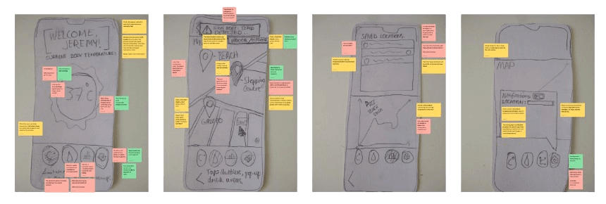
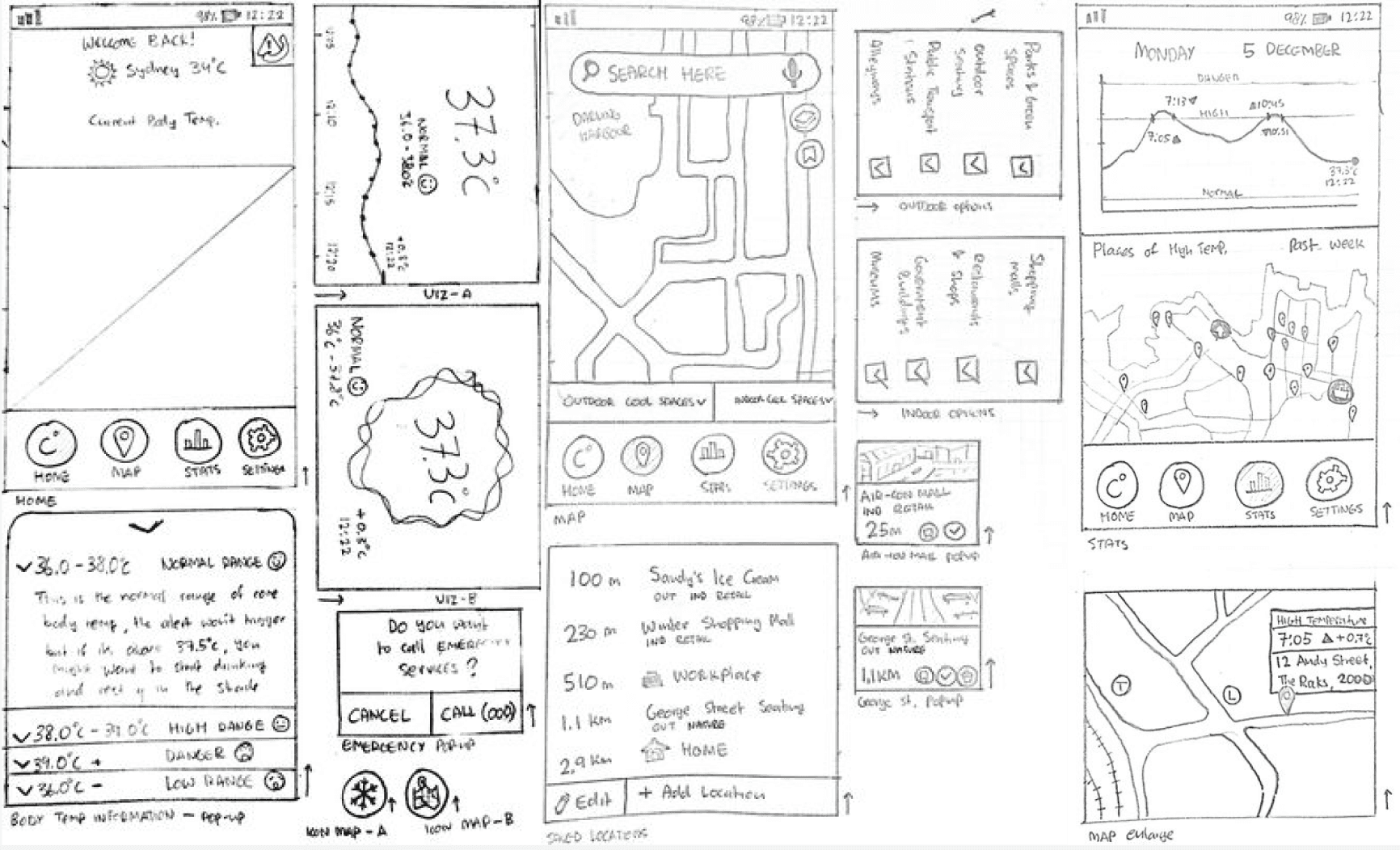
Moving from define to develop meant a lot of paper and sticky notes. The home screen is the whole product in a glance, so we used cognitive walkthroughs and A/B testing to work out what people needed immediate access to.
Testing overlays in person with UI/UX experts and passers-by across a full day, one thing was clear: users wanted glanceable information and proactive suggestions, not another dashboard to manage.
Theme
Real-time cooling
Users wanted real-time cooling help built into familiar services like Google Maps.
Theme
Passive by default
They preferred subtle, wearable tech that works in the background without active management.
Theme
Glanceable UI
They needed interfaces that read at a glance, especially when fatigued or overwhelmed.
05 - Wireframing and testing
Two wireframe rounds, tested against three goals.
We ran two wireframe iterations with user and expert testing. Feature 1, Tips to Cooldown, was restructured for clarity so people could find what they needed the moment the heat hit. Feature 2, Navigation, folded in familiar map cues to reach nearby shaded parks, water stations and air-conditioned spots. Feature 3, the Temperature Log, kept confusing people, who could not see why they would check their own body temperature, so it was reworked into live alerts instead.
Every session was measured against effectiveness (can people find cooling and water easily), efficiency (task completion in under four clicks) and learnability (can first-time users understand the core functions), triangulated across cognitive walkthroughs, A/B testing and think-aloud interviews.
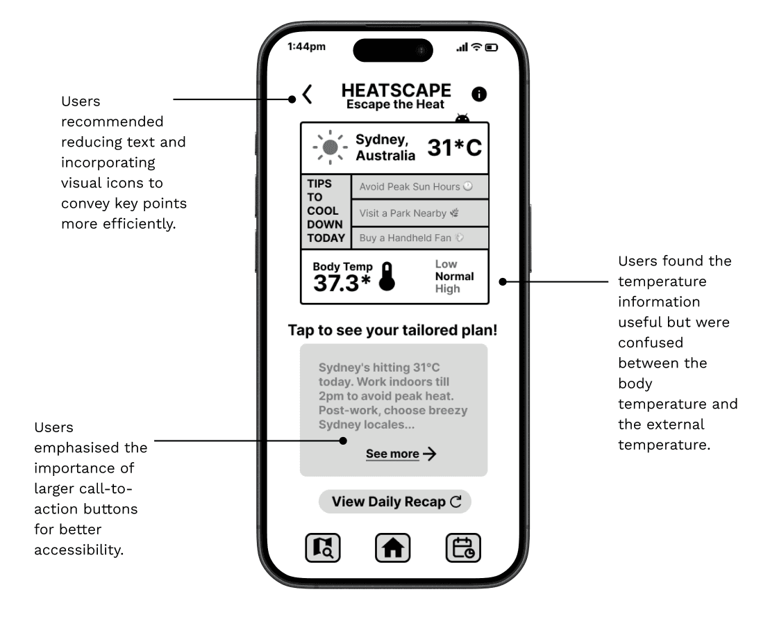
Feature 1: Tips to Cooldown. Users asked for less text and clearer visual cues, and emphasised large, accessible call-to-action buttons, so the layout leads with a tailored plan.
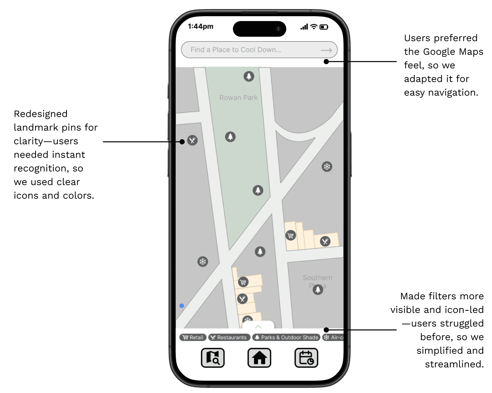
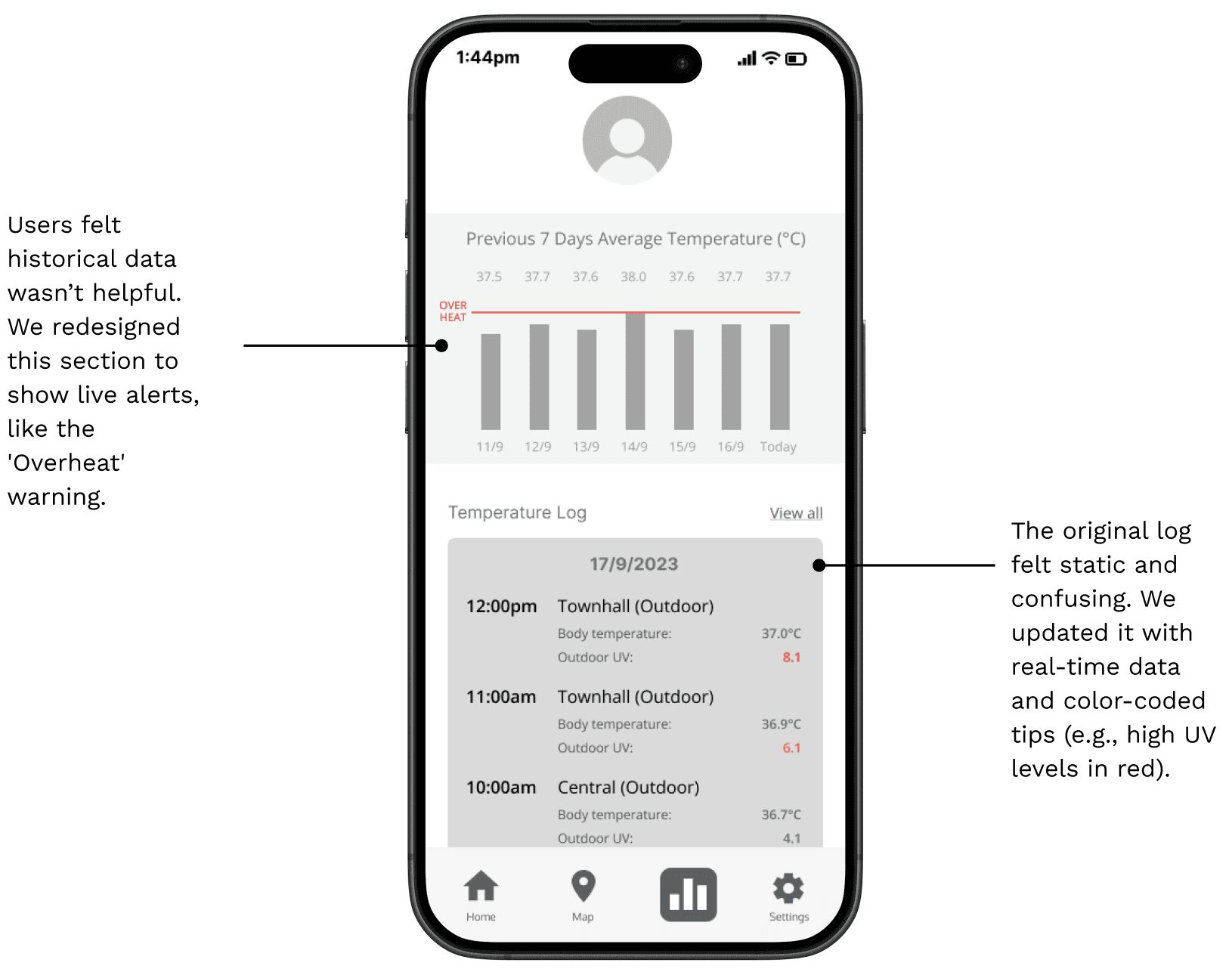
Features 2 and 3. Navigation adopted a Google-Maps-like feel users already trusted, with clearer icon-led pins. The confusing historical log was rebuilt into live, colour-coded alerts such as an Overheat warning.
06 - Deliver
A high-fidelity system, then a working MVP in code.
We chose the home screen and finalised the third feature out of mid-fidelity testing, then polished the interface: brand colours, logos, typography and real-time data interactions that made the app feel responsive rather than static.
I then built the MVP to prove the design was feasible, integrating OpenAI and Google Maps on an ESP32 board so the concept ran in real code, not just in Figma.
System Usability Scale
87
From over 50 users and experts at the University of Sydney.
Studio outcome
HD
Scored a Distinction, and the only project among many AI concepts to integrate AI with a working coded prototype.
07 - The summary
One poster, the whole system.
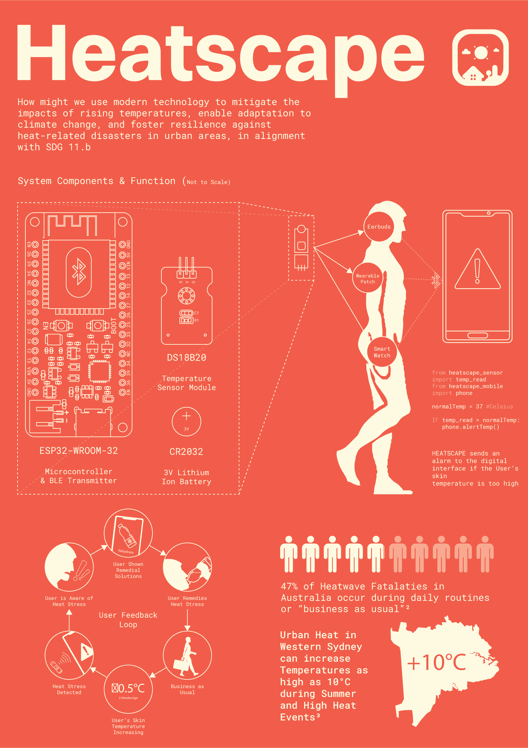
The final poster ties it together: the hardware components, the AI navigation, the wearable cooling, and the case for acting on heat before it becomes an emergency.
Learnings & impact
What the work changed about how I build.
- Behaviour beats stated preference. The strongest design cues came from watching people cope with heat, not from what they said they wanted in a survey.
- A confusing feature is a signal, not a failure. Users could not place the temperature log, so we rebuilt it into live alerts rather than defending the original idea.
- Glanceable wins under stress. People make heat decisions while fatigued, so the interface had to read in a second and suggest the next move for them.
- Ship it in real code. Coding the MVP on real hardware was what turned an AI concept into something that could be judged as feasible.